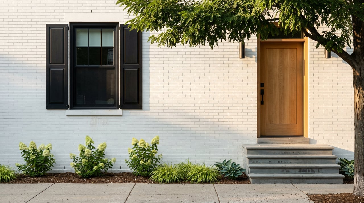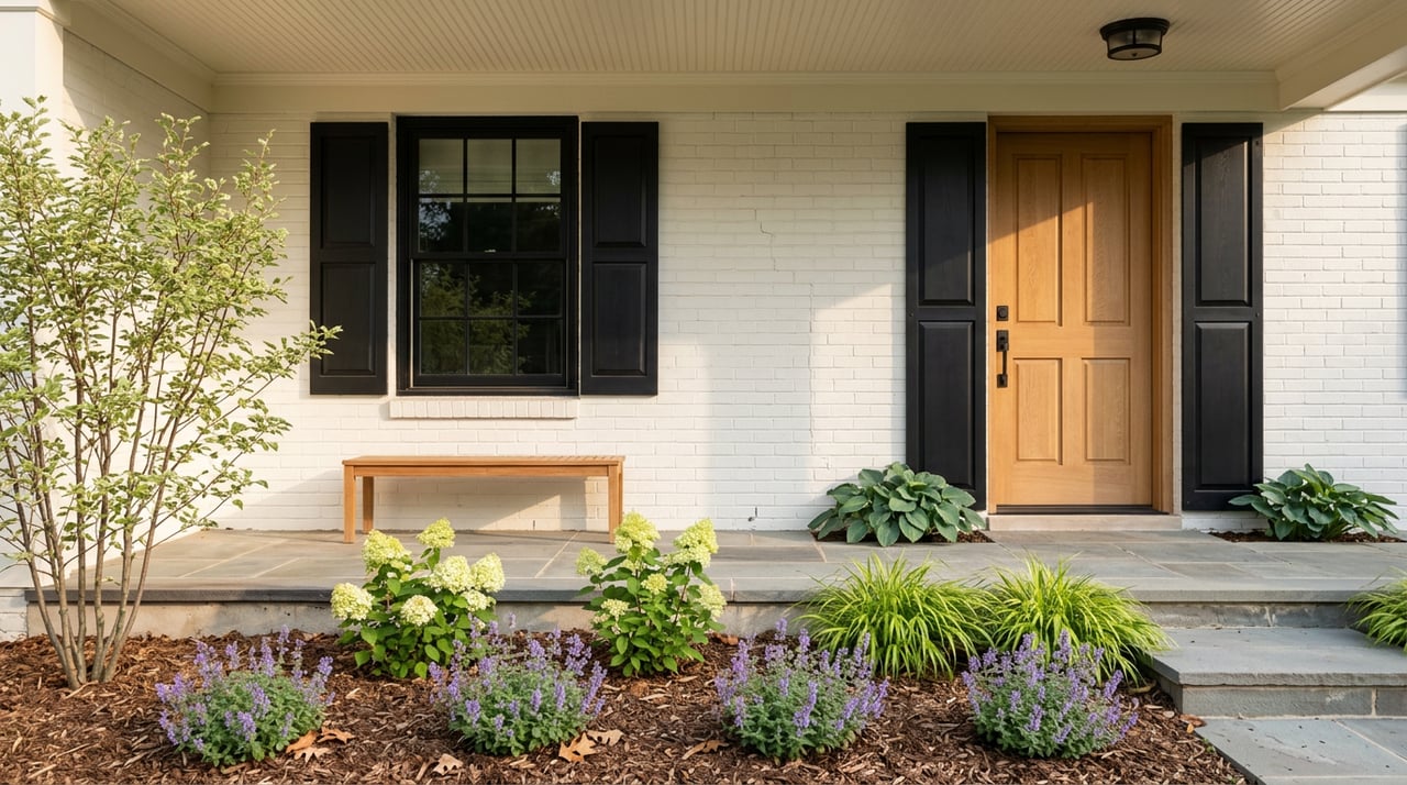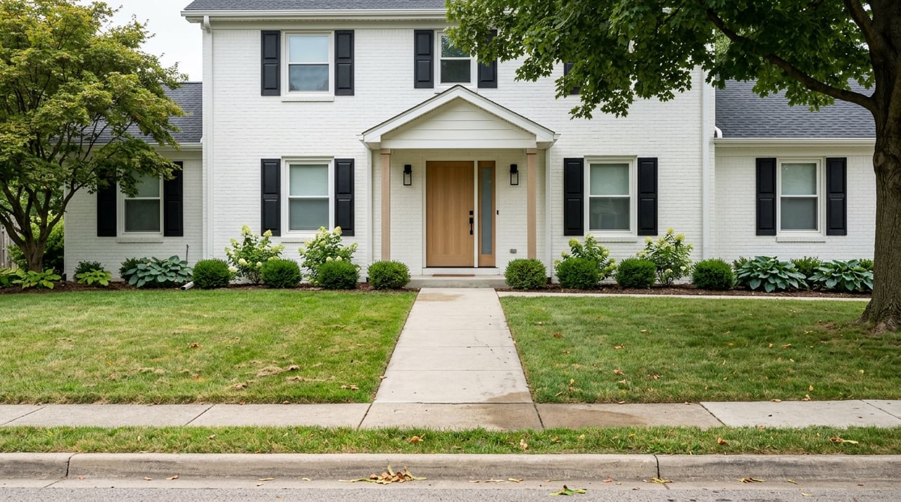
Choosing the right paint color can transform your living space, affecting not only the aesthetics but also the mood and functionality of a room. The science behind color choices is more than just personal preference — it’s grounded in psychology, design principles, and how light interacts with pigments.
Whether you’re hoping to create a calm retreat or a vibrant, energizing space in your Roselle home, understanding the science of color will guide your decisions.
The Basics of Color Psychology
Color psychology plays a significant role in how a living space is experienced. Every color evokes a different emotional response, influencing comfort and productivity. Warm colors like reds, oranges, and yellows tend to stimulate energy, creativity, and warmth, while cooler colors like blues, greens, and purples encourage calmness, relaxation, and focus. Neutral shades, including whites, grays, and beiges, create balance, serving as versatile backdrops that can adapt to various moods or complement accent colors.
When choosing paint tones, consider the mood you want to set in each room. For example, lively communal areas, such as the living room or kitchen, can benefit from warm, energetic tones, while cooler colors are ideal for bedrooms and offices, where relaxation or concentration is key.
When choosing paint tones, consider the mood you want to set in each room. For example, lively communal areas, such as the living room or kitchen, can benefit from warm, energetic tones, while cooler colors are ideal for bedrooms and offices, where relaxation or concentration is key.
The Impact of Natural Light on Color
Lighting plays an essential role in how paint colors appear throughout the day. The amount of natural light a room receives, along with the direction it faces, can dramatically change the appearance of your chosen tones.
- North-facing rooms: These spaces tend to have cooler, bluish natural light, which can make colors appear more subdued. To counteract this effect, consider using warmer tones, such as creamy whites, soft yellows, or warm beiges.
- South-facing rooms: These rooms are blessed with ample natural light throughout the day, which can make most colors appear vibrant and full of life. This gives you more flexibility to use cooler tones, such as soft blues or greens, without the room feeling too cold. If you prefer bolder hues, south-facing rooms are ideal for deeper, saturated colors like navy or charcoal.
- East-facing rooms: The morning light in these areas brings a soft, warm glow, making cooler colors like pale blue or lavender look fresh and energizing. However, as the day progresses, these rooms lose light, so opting for colors that don’t feel too cold in the afternoon — like peachy pinks or warm neutrals — can maintain a welcoming feel.
- West-facing rooms: These rooms receive warmer light in the evening, which can intensify rich hues and make warm colors look particularly striking. Earthy tones like terracotta, burnt orange, or mustard work well in west-facing spaces, creating a cozy ambiance in the late afternoon.
When choosing paint tones, consider how your chosen color will interact with natural light at different times of the day, and test your samples in both morning and evening light.
Selecting the Perfect Color for Living Rooms
Living rooms are the heart of the home, serving as spaces for socializing, relaxation, and entertainment. The paint colors you choose should reflect the atmosphere you want to create. If you aim for a bright and open feel, lighter neutrals like warm whites, soft taupes, or light grays work well to make the room feel spacious and inviting. You can introduce accent walls in deeper shades to add visual interest without overwhelming the space.
For those seeking a cozier ambiance, opt for richer, earthier tones, such as soft terracotta, muted greens, or deep browns. These colors evoke warmth and comfort, ideal for making your living room feel like a serene escape.
Texture also plays a major role in how color is perceived. Matte finishes can make a bold color feel more subdued, while glossy finishes enhance light reflection and can make a room feel more dynamic.
Calming Colors for Bedrooms
Bedrooms should be a sanctuary for rest and relaxation, and the paint color you choose plays a key role in setting the tone. Cooler shades, especially those found in nature, are often the best choice for promoting calmness and tranquility.
Soft blues, delicate lavenders, and muted greens evoke a sense of peace, creating a soothing environment that encourages restful sleep. If you prefer a neutral palette, consider shades of pale gray, warm beige, or soft ivory. These colors create a timeless, serene backdrop that can be accented with colorful bedding or artwork.
Avoid overly bright colors in the bedroom, as these can interfere with relaxation. Instead, opt for softer tones that reflect a peaceful, calming atmosphere.
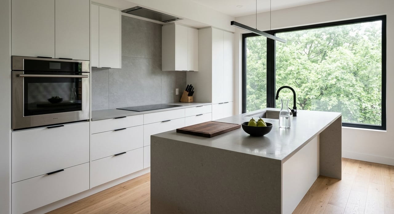
Energizing Tones for Kitchens
Warm tones like soft yellows, muted oranges, or even pastel reds can invigorate the kitchen space, making it feel lively and cheerful. These hues are known to stimulate appetite and conversation, making them ideal for kitchens and dining areas.
Alternatively, if you prefer a more modern or minimalist aesthetic, crisp whites or light grays can create a clean and fresh look, which can be complemented by colorful accents through cabinetry, backsplashes, or appliances. The key is to strike a balance between creating a functional workspace and an inviting atmosphere.
Alternatively, if you prefer a more modern or minimalist aesthetic, crisp whites or light grays can create a clean and fresh look, which can be complemented by colorful accents through cabinetry, backsplashes, or appliances. The key is to strike a balance between creating a functional workspace and an inviting atmosphere.
Productive Colors for Home Offices
With more people working from home, creating a productive and inspiring office space has become increasingly important. When choosing paint colors for a home office, consider how different hues impact focus and creativity.
Cooler tones like blues and greens are often associated with concentration and calm, making them ideal for spaces in which you need to be productive. These colors help to reduce stress and create a focused environment.
For a more creative vibe, consider adding accent walls in bolder hues like teal, mustard yellow, or coral. These colors can energize the space without being too distracting, helping to spark new ideas and innovation.
If your home office is in a smaller room or lacks natural light, lighter colors like pale gray or soft white can make the space feel more open and airy, promoting a clear, clutter-free mindset.
Choosing the Right Color for Bathrooms
The right shades can make even the smallest space feel like a spa-like retreat. Light and airy colors are often the best choice for bathrooms, as they reflect light and create a clean, fresh look. Soft blues, seafoam greens, and crisp whites work particularly well in bathrooms, evoking a sense of cleanliness and relaxation. These colors are also reminiscent of water and nature, further enhancing the spa-like setting.
If you want to add a touch of luxury, consider adding accents in deeper hues like navy or charcoal. Paired with metallic fixtures and natural materials like wood or stone, these colors can make your bathroom feel modern and elegant.
If you want to add a touch of luxury, consider adding accents in deeper hues like navy or charcoal. Paired with metallic fixtures and natural materials like wood or stone, these colors can make your bathroom feel modern and elegant.
Finding Balance
The science of choosing paint colors is all about balance — balancing light, mood, and design to create spaces that feel both functional and aesthetically pleasing. Whether you’re aiming to make a space feel larger, cozier, or more energizing, understanding how color influences mood and perception is key to making the right choices.
If you’re ready to begin your adventure in Roselle, IL, real estate, consult with Holly Priestley of GetBurbed today for expert guidance.
If you’re ready to begin your adventure in Roselle, IL, real estate, consult with Holly Priestley of GetBurbed today for expert guidance.